Why my printables look plain on purpose
I worked in printing for years before this.
So when I see a free printable pack that’s forty pages of full-color artwork, my first thought isn’t how generous. It’s: what is that going to cost the person who prints it?
Free printables aren’t free. They’re free to download. The cost gets handed to you at the printer, and nobody who makes them has to look at your cartridge.
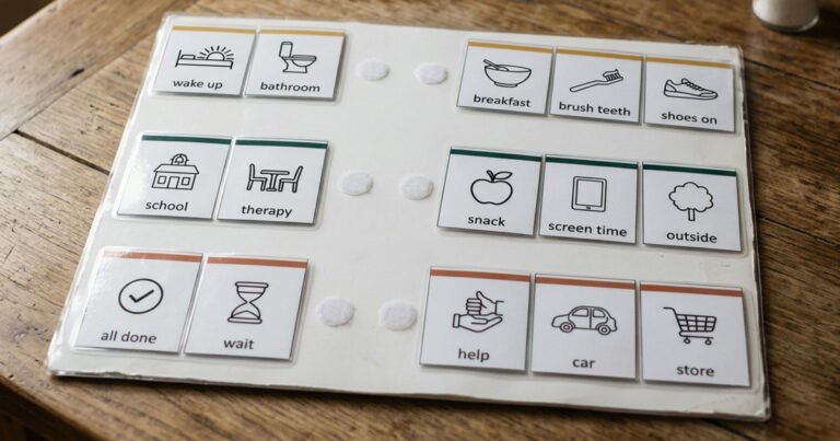
My cards are a black and white visual schedule: plain line drawings, no color anywhere. That’s not me running out of time or design ideas. Every one of those choices is doing a job, and I’d rather explain them than have you assume the pack is basic.
Black and white, because color is the expensive part
Home printing has quietly gotten worse.
It used to be that you bought a printer, you bought ink, and the ink was expensive but at least it was yours. Now a lot of printers come tied to a subscription. You pay monthly for the right to use them — and some will stop printing when you cancel, even with ink still sitting in the cartridge.
I’m lucky. I have an old LaserJet and I can still buy off-brand toner for it. Most people can’t. Most people have an inkjet, or something subscription-tied, and a full-color printable is a genuinely expensive thing to run off — especially for a set of cards you’re going to reprint, because cards get chewed, lost, taped to things and left in the car.
So the whole pack is designed for the cheapest possible print. Black lines, white space, no background fills, nothing that puts down a solid block of anything.
Print it on the worst printer in the house and it still works.
The one place I used color, and why it doesn’t matter if you skip it
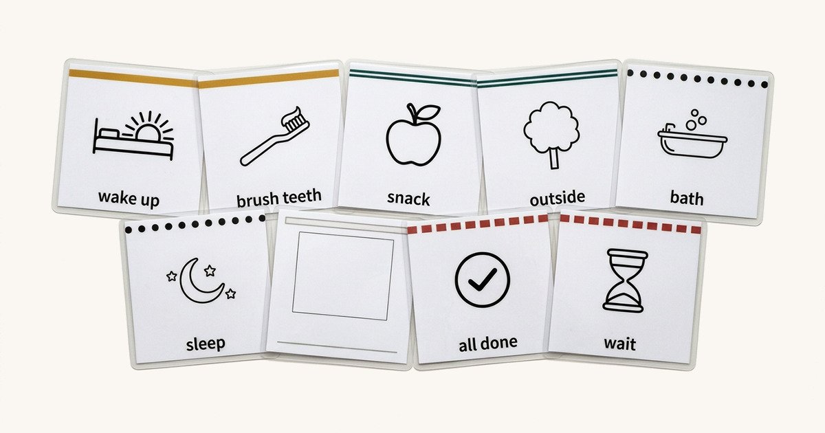
There is color in the pack. One thin band across the top of each card, and a different color for each group — morning, daytime, evening, transitions. That’s the entire color budget for twenty-four cards.
It’s there because sorting a pile of freshly cut cards into groups is genuinely easier when the groups look different, and because a page of nothing but black lines is a bleak thing to hand someone.
But color can’t be the only thing doing that job. Print in black and white and all four bands come out as the same gray line, and you’ve lost the grouping entirely.
So each band also has its own line pattern. Solid, double, dotted, dashed. In color you sort by color. In black and white you sort by pattern. Either way the groups stay apart, and you haven’t lost anything by printing the cheap way.
That’s the rule I try to hold myself to: if two things can only be told apart by their color, the design has already failed — for anyone printing in grayscale, and for anyone who doesn’t see those colors the way I do.
Simple shapes, because a busy picture takes longer to read
This one isn’t about money.
A photograph of a bathroom contains a bath, a toilet, a sink, a towel, a bath mat, tiles, a window, a bottle of something on the edge. A line drawing of a bath contains a bath.
Both of my nonverbal sons tend to pause and examine when there’s a lot of visual noise. They’ll stop, study the whole thing, take it in properly. That’s not a problem — it’s how they look at things, and it’s often a strength. But a schedule card is supposed to answer one question fast: what’s happening now? If a card needs studying, it isn’t doing that job.
So every icon is stripped down to the fewest shapes that still say what it is. One object. No scene around it. No shading, no detail that isn’t carrying meaning.
There’s a test for this: shrink a card to postage-stamp size, or look at it from across the room. If you can still tell what it is, it’s simple enough. If you can’t, it’s got too much on it.
Lowercase words, because that’s what he already reads
The word on each card is lowercase. bath, not Bath.
My son’s AAC device uses lowercase on its buttons. He reads those every day, more than he reads anything else. It would be strange for the cards on the wall to look different from the words on the device in his hand.
It isn’t perfect — there are several therapists and teachers using that device with him, and every so often a capital letter appears on something. It usually gets changed back. But the default is lowercase, so the cards are lowercase.
If your child’s device or school system uses something different, use theirs. Matching what they already know beats matching me.
Six blank cards, because I don’t know your kid
Twenty-four cards in the pack, and six of them are blank.
That’s a quarter of the set given over to I can’t guess this part. And that’s deliberate, because I want people to have the freedom to try anything.
Draw on them. Print a photo and stick it on. Cut something out of a catalog. Write a word with no picture at all. Use your actual bathtub, their real backpack, the specific cup that is the only acceptable cup.
Sometimes a photo of the real thing works when my drawing doesn’t. That’s not my icon failing — some kids map a symbol to a real object easily, some need the object itself first and get to symbols later, and you find out which by trying. The blanks are where you find out.
None of this is permanent
That’s the part I’d most want you to take away.
A visual support is a tool you use over and over, and it changes as your child changes. The cards you need this year aren’t the cards you’ll need in three years. My son’s AAC device changes too — new buttons, new words, things taken off because they stopped being useful.
I made a set of defaults. A black and white visual schedule, to save your ink. Simple shapes so they read fast. Lowercase to match what a lot of kids already see. Six blanks because I knew the defaults wouldn’t fit everyone.
Use the parts that work. Change the parts that don’t. That’s what the blanks are for, and it’s what the whole thing is for.
Which card would you make first, if you were filling in the blanks?
Hit reply on any of my emails. I read them all.
Want the visual schedule pack?
Twenty-four routine cards, six blanks, and two ready-to-use routines. Free, and honest about what to expect when it doesn’t work the first week.